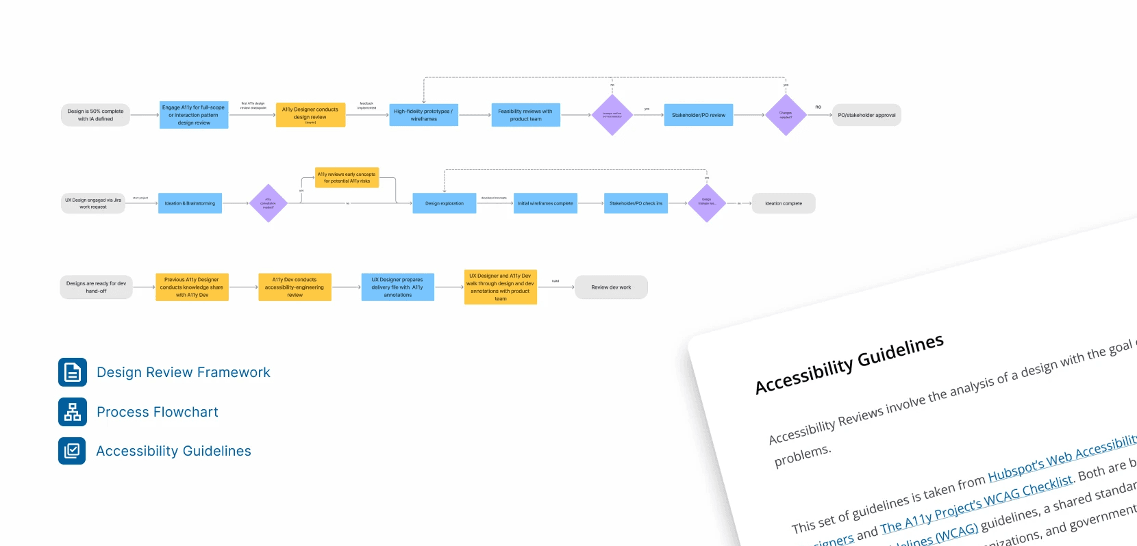
Project overview

My role and contribution
The problem
Why redesign?
Bivouac's digital experience doesn't reflect the quality of its in-store experience, a gap that risks conversion for online shoppers

Bivouac's homepage
Research
Field visit

Interior of Bivouac
Products were organized via everyday clothing vs. outdoor gear, a strategy that targeted 2 distinct shopping habits: casual and sporting wear
Card sorting
Users group outdoor activities under a distinct "sporting" group
Users group activity-related products under "gear" or "equipment"
Sorted information architecture
ACTIVITY
Climbing
Hiking
Camping
Everyday outdoor
GEAR
Ropes
Water bottles
Harness
Helmet
First Aid
ACCESSORIES
Jewelry
Scarves
Socks
Bags
Sunglasses
CLOTHING
Sweaters
Tops
Dresses
Shorts
Pants
SHOES
Running shoes
Sneakers
Sandals
Boots
Personas


UX Opportunities for each persona:
Advanced filtering by material, type, brand → Outdoor Adventurers
Support product-first navigation alongside activity→ Practical Buyers
Curated featured styles sections → the Browser
Design strategy
01
Design system
Refresh the visual design without losing its original character
02
Information architecture
Simplify IA to accelerate decision-making and minimize cognitive overload
03
Usability
Implement UX opportunities that address different buyer's needs
Design system
Variables and tokens


Components and templates


Information architecure
Sitemap

Navigation bar

Explore the design file
Learnings
Following this project, I learned 3 valuable lessons
Creating variables
Creating 100+ variables taught me how to maintain consistency throughout design
Designing with technical feasibility
Redesigning pages challenged me to consider the technical feasibility of implementation
Rooting design choices in data
Because this project was not research-focused due to scope, I learned how to find and use existing data to support my decisions
Back to top
More case studies
Check out another project